We all want fresh, lively spaces that feel like home. But when it comes to bold colors, many hesitate. I get it.
The jewel tones trend can feel overwhelming, but it doesn’t have to be.
This article will demystify that trend and give you practical guidance on how to embrace it in your own home. I’ve spent years tracking design inspirations and home decor trends. So you can trust this advice to be curated and actionable.
Imagine walking into a room painted in rich emerald green or deep sapphire blue. The right color can totally uplift your mood and make your space feel truly yours.
You’ll discover how to transform your living area with changing, joyful colors. By the end, you’ll have the confidence to pick shades that reflect your personality. Let’s dive into how you can make your home a lively expression of who you are.
Beyond Bright: The Rise of Lively Colors
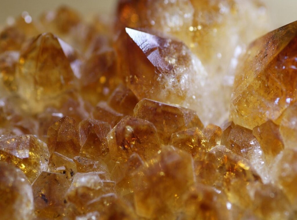
Lively color palettes aren’t just about being loud or flashy. They’re about high saturation and making bold statements. Think of the jewel tones trend.
It’s more than just a splash of color. It’s an entire mood.
What’s the deal with lively colors then? For starters, they thrive on contrast. A rich emerald paired with a zesty orange isn’t just eye-catching.
It’s electric. This isn’t neon; it’s thoughtful color play, creating spaces that feel alive and full of energy.
But how did we get here? We’ve moved past the era of minimalist neutrals. Sure, gray had its day in the sun, but people crave more personality now.
We want our homes to be extensions of who we are, filled with optimism and individuality.
Ever seen a room with earthy tones accented by vivid blues or reds? It’s like a scene out of a Wes Anderson film. These combinations aren’t just decorative.
They add depth and interest, making spaces changing without being overwhelming.
Lively palettes can transform your home. They invite you in, encouraging you to linger. It’s like walking into a scene from a favorite movie (familiar) yet thrilling every time.
Who doesn’t want their living room to feel like a Hollywood set? (Minus the drama, of course.)
Feeling bold yet?
Color Psychology: Why Bold Hues Matter Now
Ever wonder why certain colors make you feel different emotions? Bold hues aren’t just eye candy. They’re a psychological trigger. Lively colors like yellows and blues have specific effects on our mood and well-being.
Yellow can spark joy, while blue calms us down (think of a serene ocean). It’s fascinating how color influences feelings.
We’re seeing a societal shift. People crave optimism and self-expression. That’s why the jewel tones trend is exploding.
Lively palettes break away from the bland, traditional design norms. They stimulate creativity and boost energy. In today’s world, where digital overstimulation is rampant, these colors ground us in something real.
Ever notice how a colorful room can transform your mood?
Designers are riding this wave. They’re leveraging color psychology to create spaces that look good and feel even better. It’s not just about aesthetics.
It’s about crafting environments that connect emotionally. Spaces that tell a story.
Feeling oversaturated with tech? Bold colors offer an escape. They create memorable, personalized environments that refresh the mind.
Want to dip your toe into this trend? Balance bold hues with minimalist decor simple elegance for a refreshing contrast. This approach will boost your living space without overwhelming it.
Who knew colors could do so much?
Curating a Changing Palette: Lively Color Magic
Color theory might sound complex, but it’s simpler than you think. First, let’s talk about the jewel tones trend. These are colors that pop, like emerald and ruby, and they make any space feel luxurious.
But how do you balance these rich shades? Start with the basics: analogous colors are neighbors on the wheel and give a harmonious feel. Complementary colors, on the other hand, are opposites and create lively contrast.
Triadic schemes use three evenly spaced colors for a balanced outcome.
Want a practical starting point? Look around you. Nature’s a great teacher.
An old artwork or a favorite scarf can be your inspiration. But don’t go overboard (mix) in some neutrals or softer tones to keep it grounded.
Now, there’s this 60-30-10 rule. It’s all about balance. Sixty percent of a dominant color, thirty percent of a secondary, and ten percent of an accent.
This method works wonders for lively schemes, ensuring everything flows beautifully.
Tools like online color generators and mood boards are your best friends. And don’t forget to test your colors in various lighting. It’s surprising how much light can change a color’s vibe.
Consider exploring texture decor adding depth to add another layer to your color story. It’s a game-changer for creating depth in your space.
Bringing Color to Life: Vibrance in Every Corner
Color has the power to change a room’s mood, and I’ve seen it firsthand. Take the living room. A bold statement piece like a royal blue sofa or a daring accent wall can transform the space.
Layer in textiles (think) throw pillows in contrasting hues and textured rugs (to) add depth.
In the kitchen, don’t just settle for neutral. Bright cabinetry or a striking backsplash can make cooking feel like a creative endeavor. And yes, colorful dining chairs and decorative serveware can raise your dining experience.
The bedroom’s vibe is important. You can balance stimulation and serenity with lively bedding or a single piece of art. It’s amazing how a splash of color can make a sanctuary feel both lively and restful.
When it comes to home offices or creative spaces, lively hues might just boost your focus and creativity. I’ve painted my own workspace in rich greens, and it’s a game-changer. Trust me.
Small spaces and entryways? Bold colors can make them pop. A bright door or a vivid wall in a narrow hall can leave a lasting impression.
Accessories like vases and lamps, along with artwork, tie everything together without the need for permanent changes. They’re the finishing touches that make a house feel alive.
And let’s not forget the jewel tones trend that’s making waves. Incorporating these rich colors brings a timeless elegance. Why not give it a try?
Mastering the Mix: Avoiding Common Lively Palette Pitfalls
Getting lost in the jewel tones trend? I get it. It’s easy to go overboard and end up with a room that looks like a crayon box explosion.
Start small. A bold pillow or a lively vase can do wonders. Trust me, overuse or clashing isn’t a good look.
Natural light changes everything. Ever notice how a color looks different at night? That’s why you shouldn’t ignore light sources.
Instead, play with different shades of the same hue. It creates depth without chaos.
Pro tip: Add a unifying element, like a neutral rug, to tie it all together. Less is more. Build confidence with accents before diving into bigger projects.
Your Colorful Home Awaits
Fear of color? It can vanish with a thoughtful approach to the jewel tones trend. Embracing these lively hues transforms your space into a changing retreat.
You can create a home that truly reflects your personality.
Start small. Pick one accent color or create a mood board. Identify a room that needs a splash of life.
You’ll feel energized by the change.
Let your home speak to your zest for life. Your lively canvas is ready for action. Take the leap and make your space a reflection of who you are.
It’s time to embrace color and boost your mood!